|
|
Post by Wolfy on Feb 2, 2010 19:30:02 GMT -5
|
|
|
|
Post by Spitfire on Feb 2, 2010 20:11:13 GMT -5
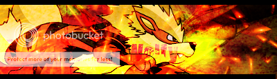
My sig is in there  |
|
|
|
Post by Leonardo on Feb 2, 2010 20:47:46 GMT -5
The sigs are excellent but the sketch needs a little work. Your shading is a little sloppy, and I have massive OCD when there's smudges where they're not supposed to be  you have so much detail in the wolf but almost none in your background . If this is because you don't want to do one then don't! It'll look like a render! Great job, keep up the good work |
|
|
|
Post by Spitfire on Feb 2, 2010 20:48:49 GMT -5
I love how u only criticized the sketch |
|
|
|
Post by Wolfy on Feb 2, 2010 20:50:48 GMT -5
Lol, thanks xD
|
|
|
|
Post by Leonardo on Feb 2, 2010 20:57:52 GMT -5
The sketch is the only thing that needs criticism! All of the sigs are incredible, plus I have no clue how to rate a sig since I've never made one |
|
|
|
Post by Spitfire on Feb 2, 2010 21:01:43 GMT -5
If you hadn't said that you don't know how to rate sigs and just left it at they don't need ratings I would've gotten Raiden here
|
|
|
|
Post by Leonardo on Feb 2, 2010 21:07:31 GMT -5
Oh boy, let's not start that up again
|
|
|
|
Post by Wolfy on Feb 2, 2010 21:17:45 GMT -5
o.O R...hes mean to my type of font.. =[
|
|
|
|
Post by Spitfire on Feb 2, 2010 21:20:41 GMT -5
He's big on typography
|
|